Sign language learning app · iOS club
Talking Fingers
Interactive Sign Language Learning Experience with Real-Time Computer-Vision Feedback

Role
Junior UX Designer
Team
1 Sr UX Designer
4 Jr UX Designers
2 Tech Leads
4 Senior Developers
15 Jr Developers
Timeline
4 months
Jan – Apr 2026
Tools and skills
Figma
Prototyping
OVERVIEW
Talking Fingers is a project of GT iOS Club where designers and developers collaborate closely to create an app in a semester. It is a sign language learning app that utilizes Apple Vision to convert hand and body observations from the camera into data points for geometric joint matching.
🙊 PROBLEM
Learning a language requires producing it, not just recognizing it. Existing sign-language learning tools let users watch and memorize signs, but don't give them a way to practice independently and understand whether their movements are correct.
Research says that producing signs led to better recall than observation, supporting the role of motor encoding and somatosensory feedback.
In a 2024 research study [1], researchers taught hearing adults unfamiliar ASL signs in two groups. One with just observation and the other with production, where participants repeatedly produced the signs themselves. The production group recalled the signs more accurately.
🐵 SOLUTION
A Sign Language Learning App with Real-Time Feedback Powered by Vision Technology.
🏆 Won Best App, Best Design, Most Popular App
RESEARCH & PLANNING
planning

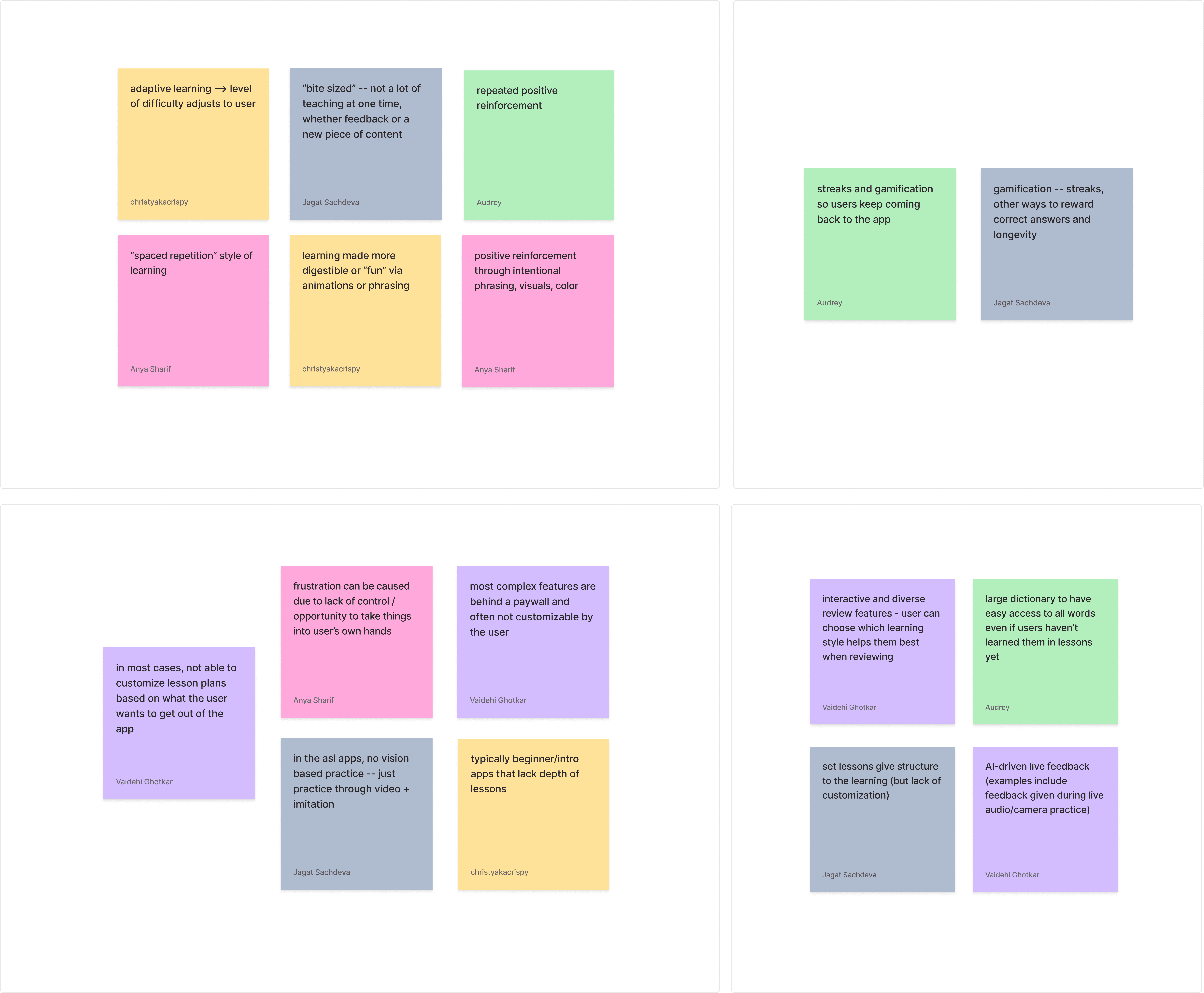
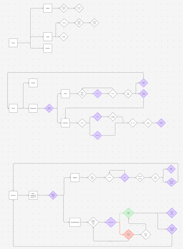
We iterated the information architecture the developers gave us through competitive analysis, affinity mapping, and user flows.

Wireframes & iDEATION

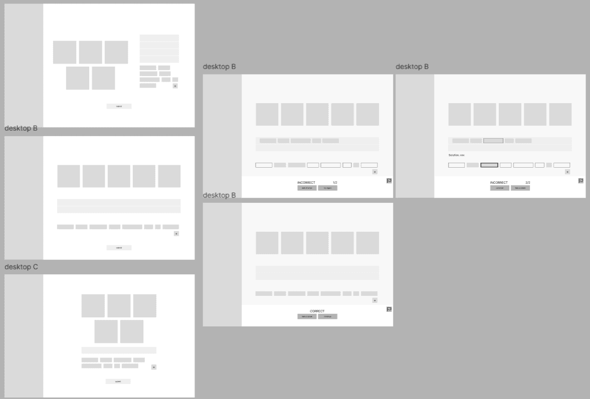
I created a couple lo-fi versions of my features for both mobile and desktop versions of the app, mostly experimenting with layout and flow.
I was also considering different features such as an "add words" feature to allow the user to customize their word bank to their difficulty of choice, as well as a report option in case the user catches a mistake from the AI.
TRADEOFFS & ITERATION
Incorrect screen

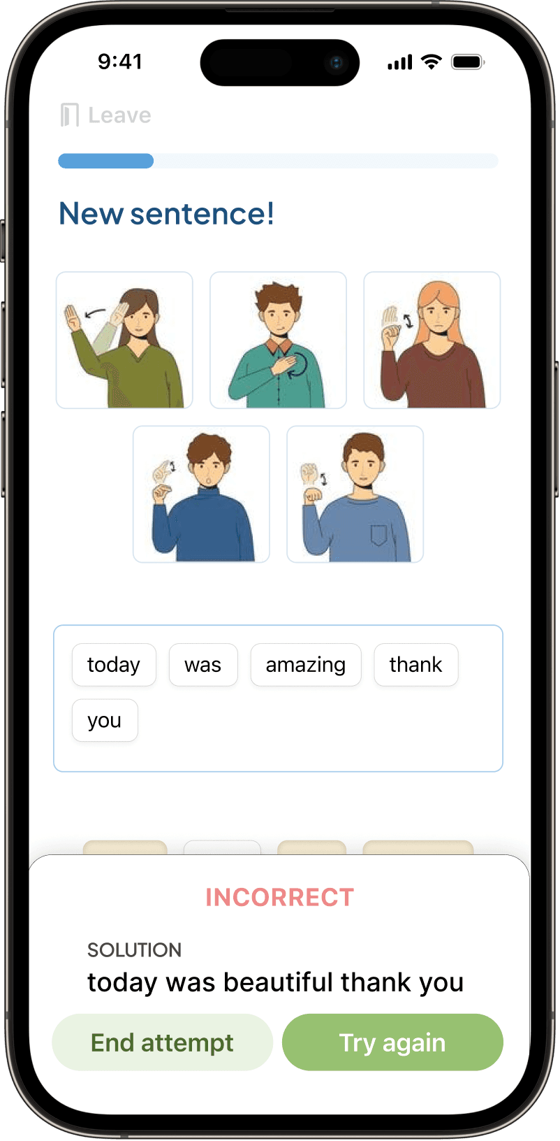
PROBLEM
Feedback was distributed across the screen
WHAT WE LEARNED
Users preferred a single feedback area because it reduced visual scanning and made the correction easier to understand.
Image viewing

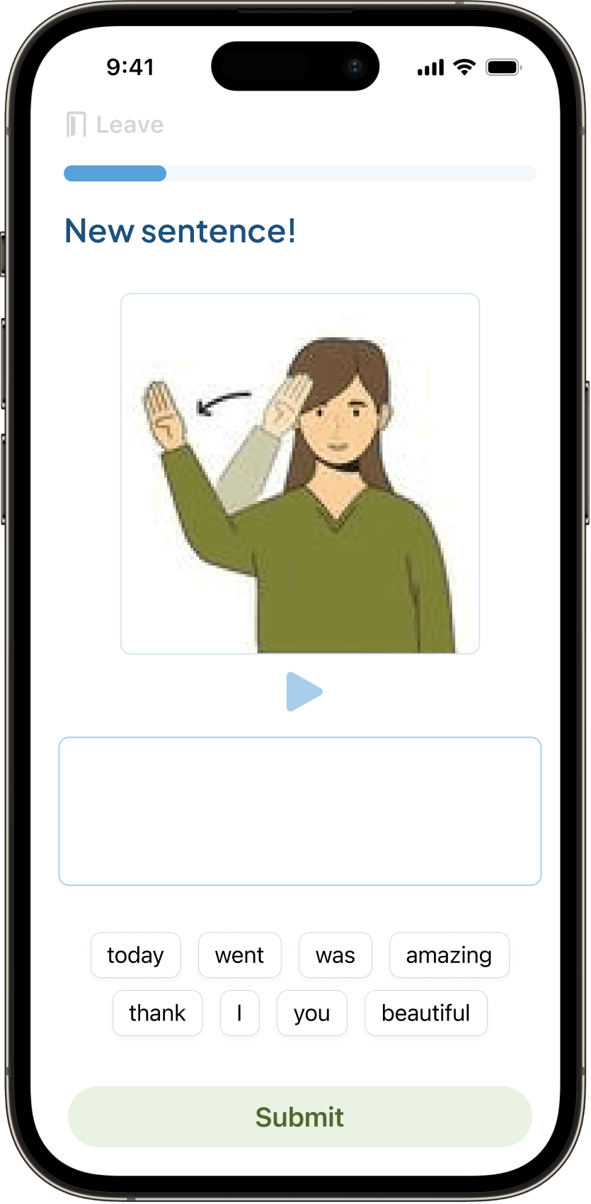
PROBLEM
Individual signs were shown as separate videos
WHAT WE LEARNED
Users preferred one continuous video with back-to-back signs because it better reflected how signing naturally occurs in full sentences.
BRANDING
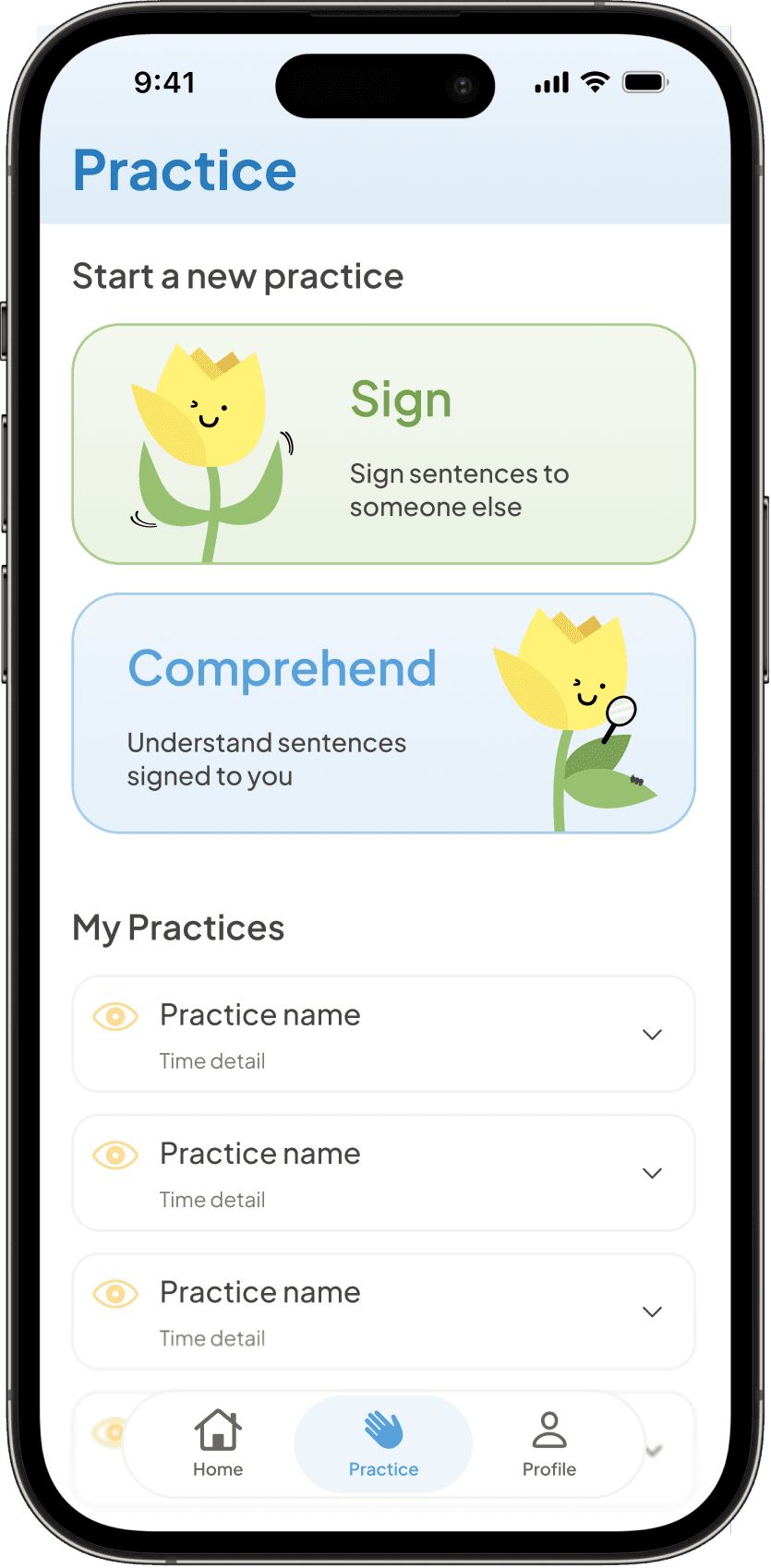
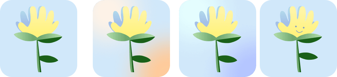
We wanted the app to be friendly and accessible, so we decided to create a mascot.
I chose a flower because we wanted the app to be plant themed, to emphasize the idea of growth.
The flower looks vaguely hand shaped, where each petal represented a finger—I then brought the mascot to life with different poses representing different app features.






DEVELOPER HANDOFF

Each screen is thoroughly labelled with interactions and animations. We also built a component system for developers to implement easily.
Final UI
A few of my screens and screens I worked on, with a focus on the learning experience, feedback interactions, and visual system.


🏆 Best App, Best Design, Most Popular App
Judge panel decision and voted after presentation at Demo Day
💭 Reflection
Designing for movement changed how I think about interaction—traditional interfaces give designers predictable inputs, such as clicks, taps, and swipes. I learned that there are so many more options than the traditional interactions.
I learned more about:
Teamwork
Building reusable components
Branding consistency
Tradeoffs and iterating
Collaborating with developers around technical constraints
Credits
[1] Morett, L. M., Cieśla, M., Bray, M. E., & Emmorey, K. (2024). Feeling signs: motor encoding enhances sign language learning in hearing adults. Studies in second language acquisition, 46(3), 933–945. https://doi.org/10.1017/s0272263124000196